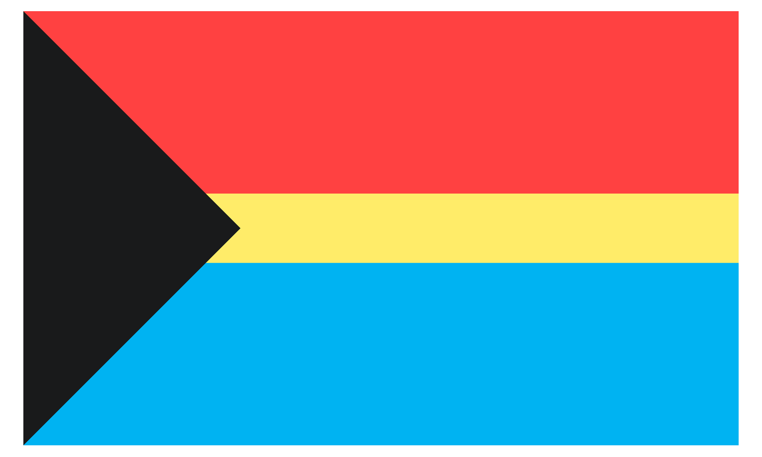
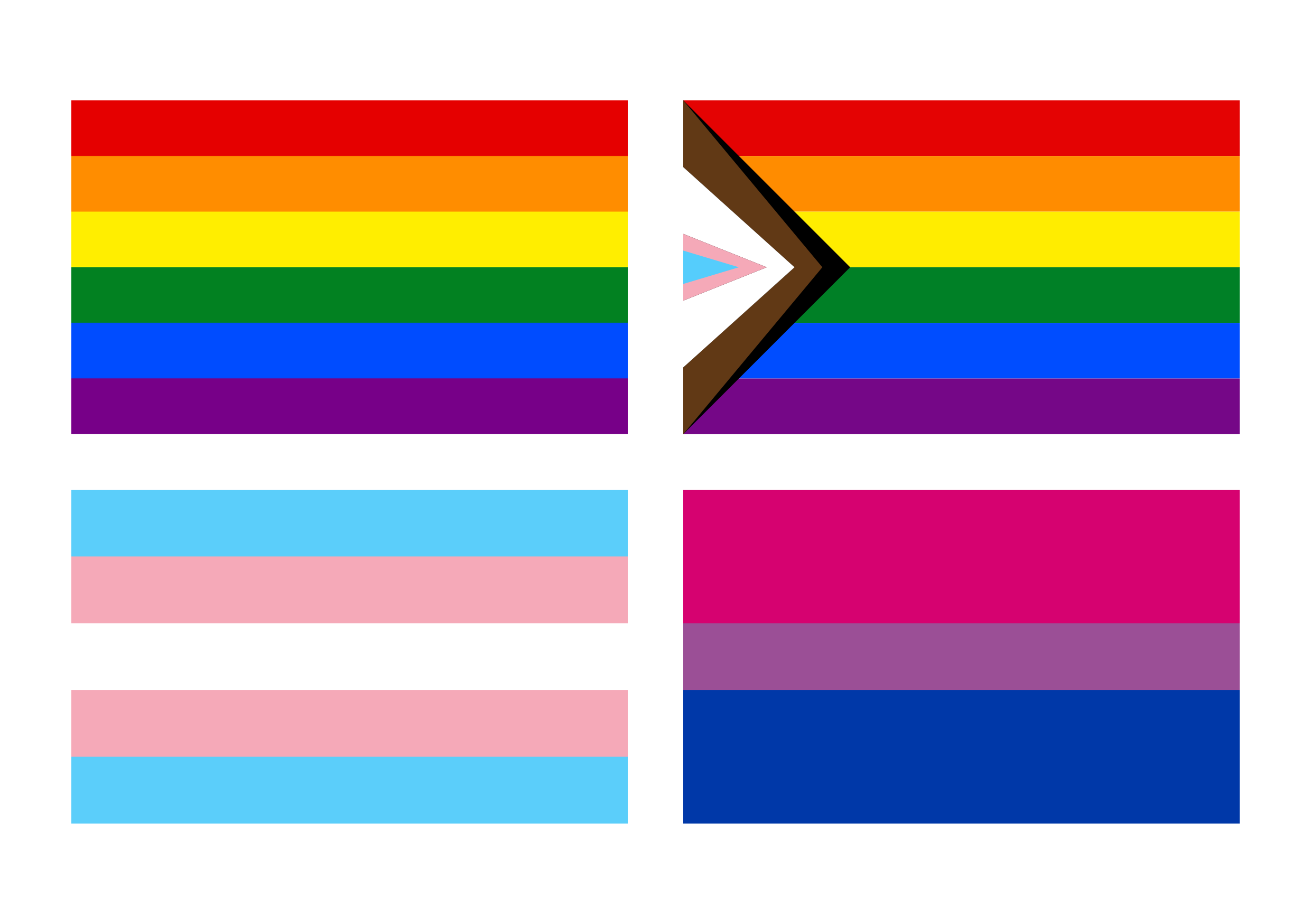
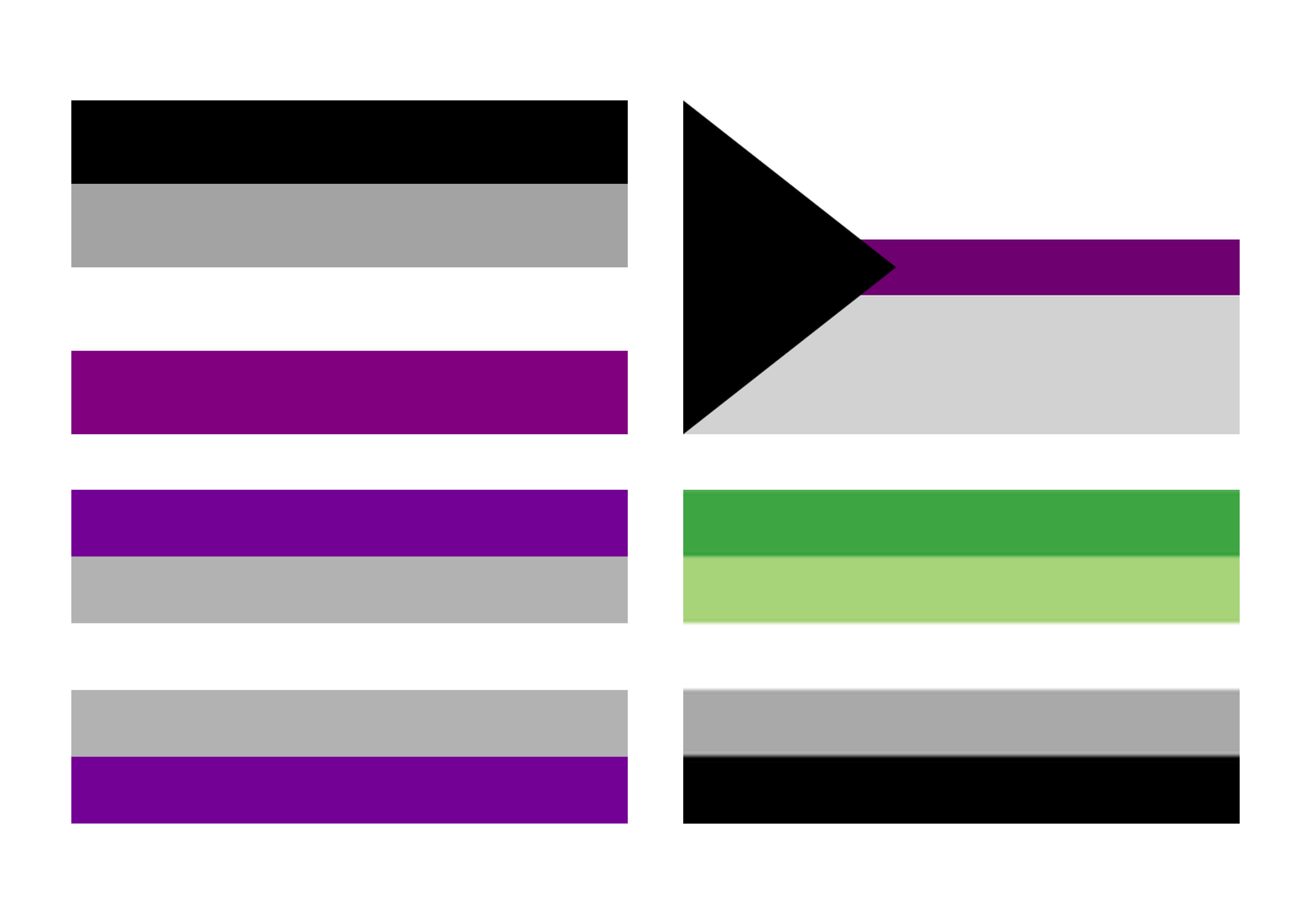
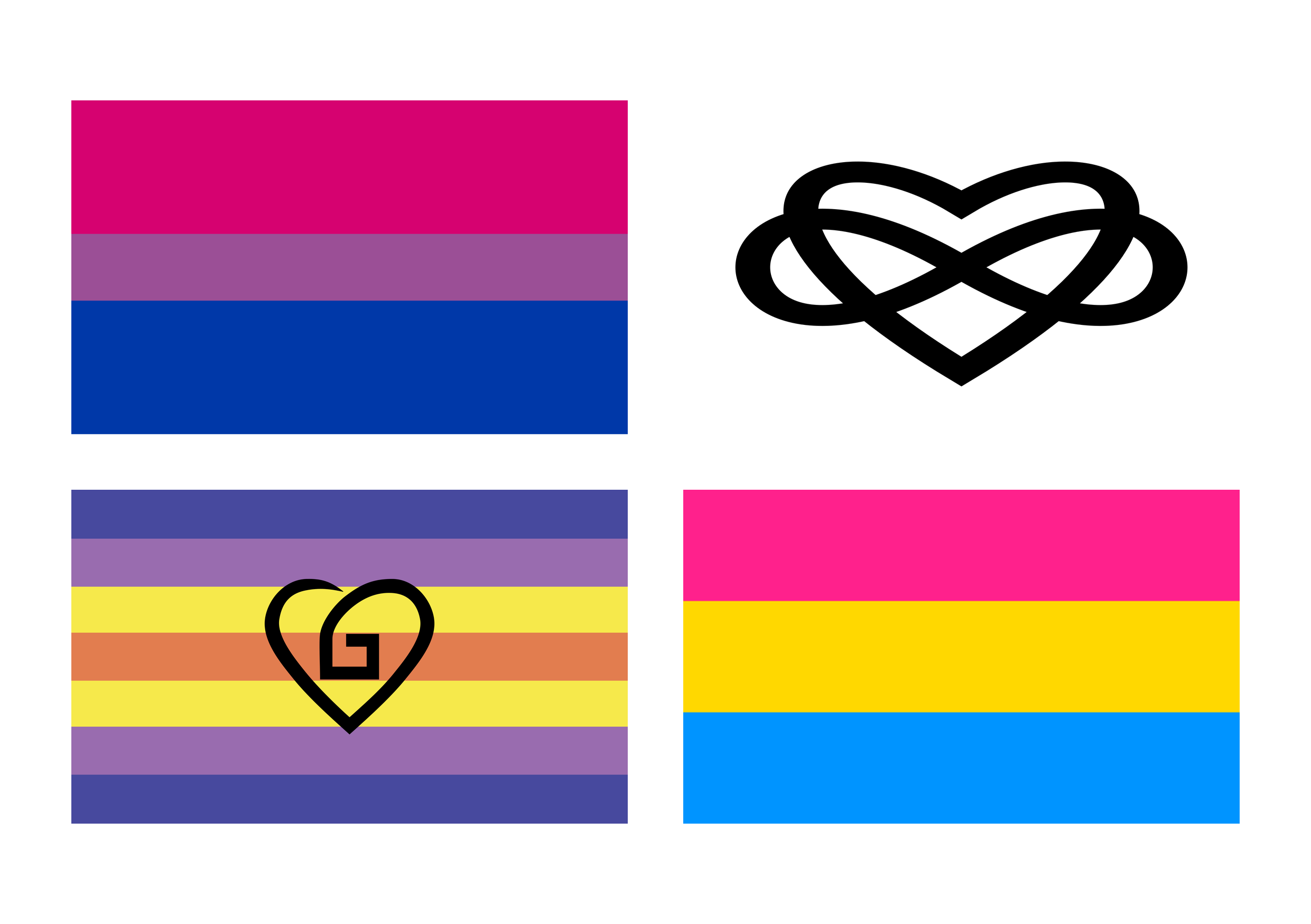
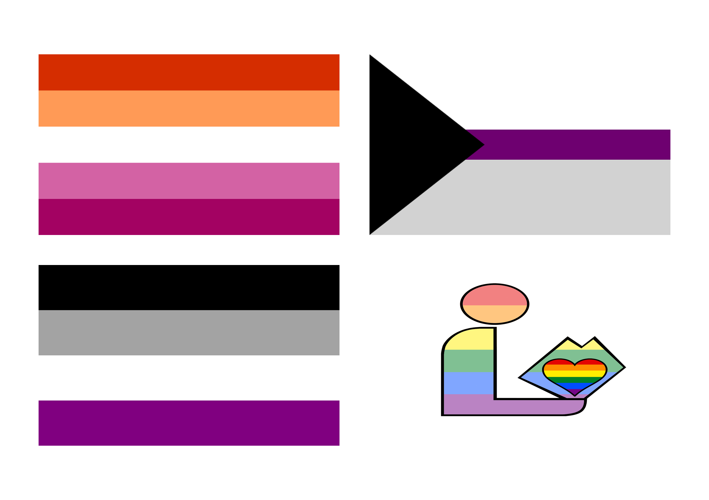
These colors represent important ideas connected to this flag and community.
History
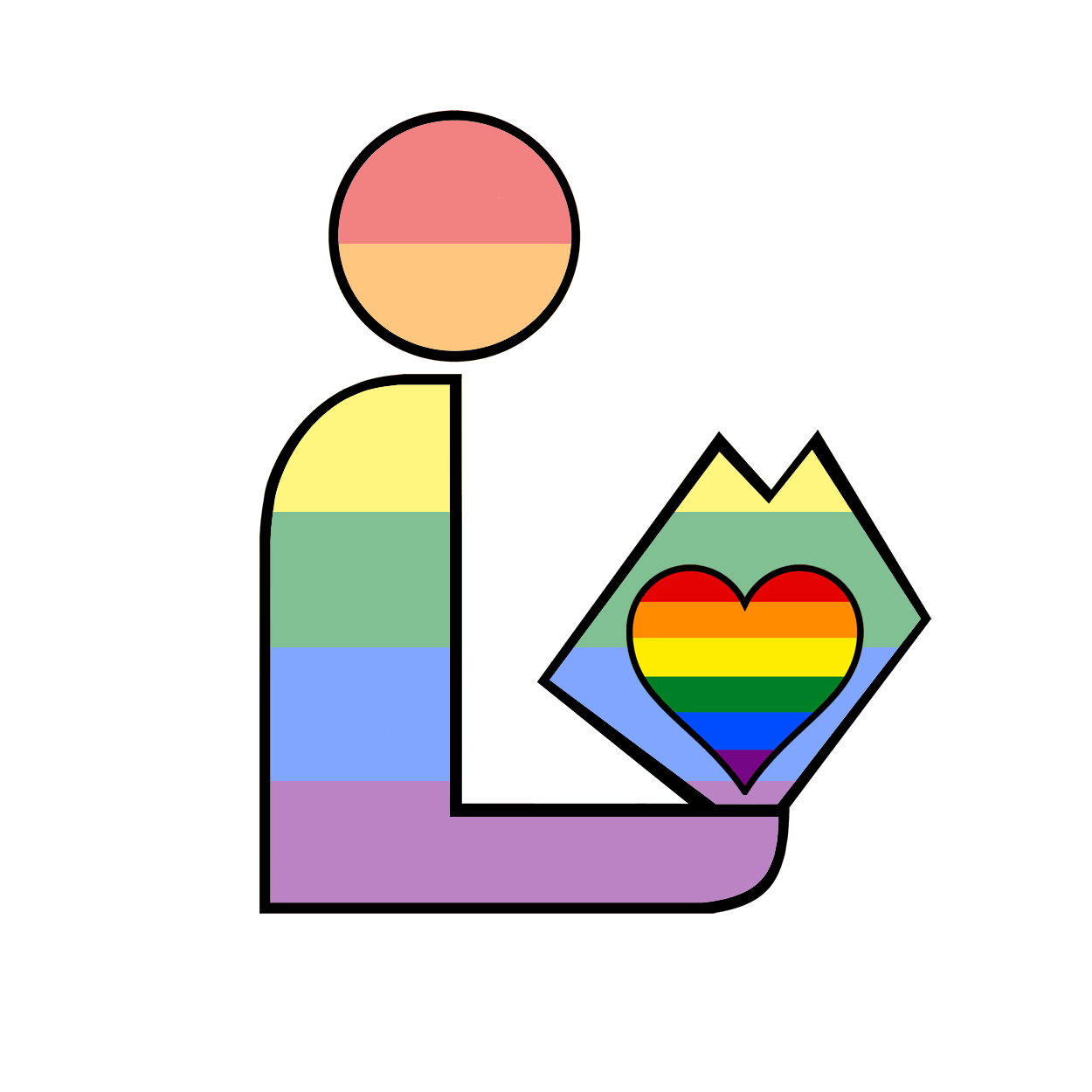
The Homoromantic Pride Library Logo is a community-created design that merges the homoromantic pride flag with the universally recognized public library logo symbol. This hybrid design reflects the increasing trend in modern pride vexillology of combining multiple identities or values within a single flag representation. The homoromantic flag itself, which uses red, orange, white, and blue stripes to represent romantic attraction to the same gender, serves as the base for this variant. By incorporating the library logo, this design symbolizes the intersection of homoromantic identity with intellectual spaces, information access, and community resources. The flag represents a specific community emphasis: homoromantic individuals who value libraries or work within library and information science professions. As with many community-authored pride flags created after the widespread adoption of the rainbow flag in the 1970s, this design emerged from online communities and local pride networks rather than through any formal registry.