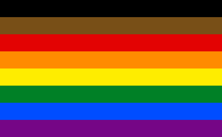
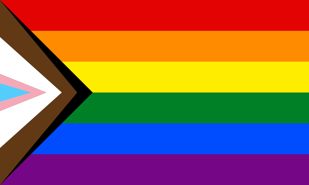
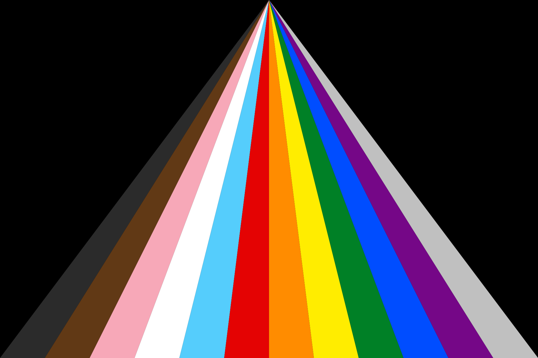
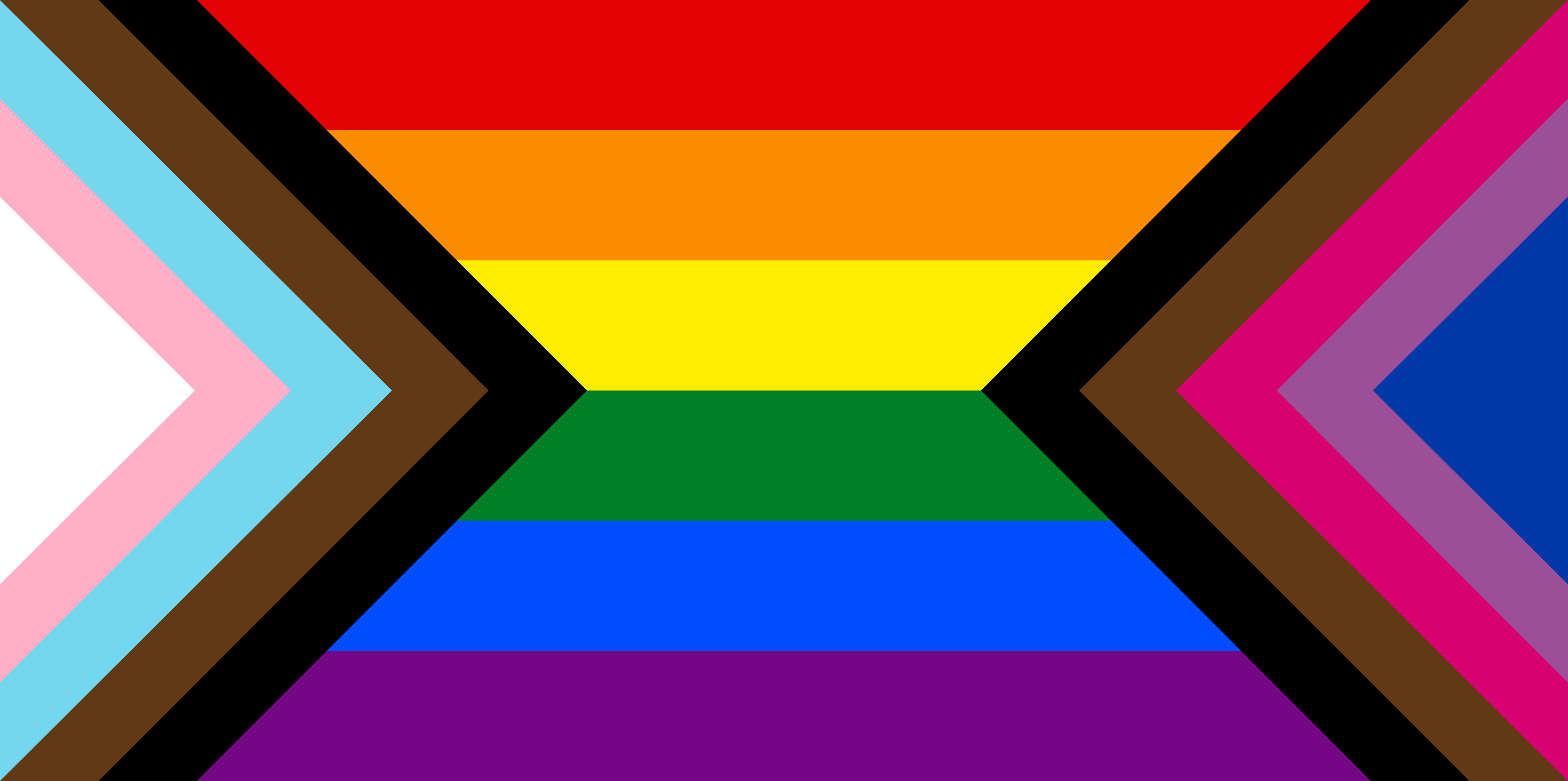
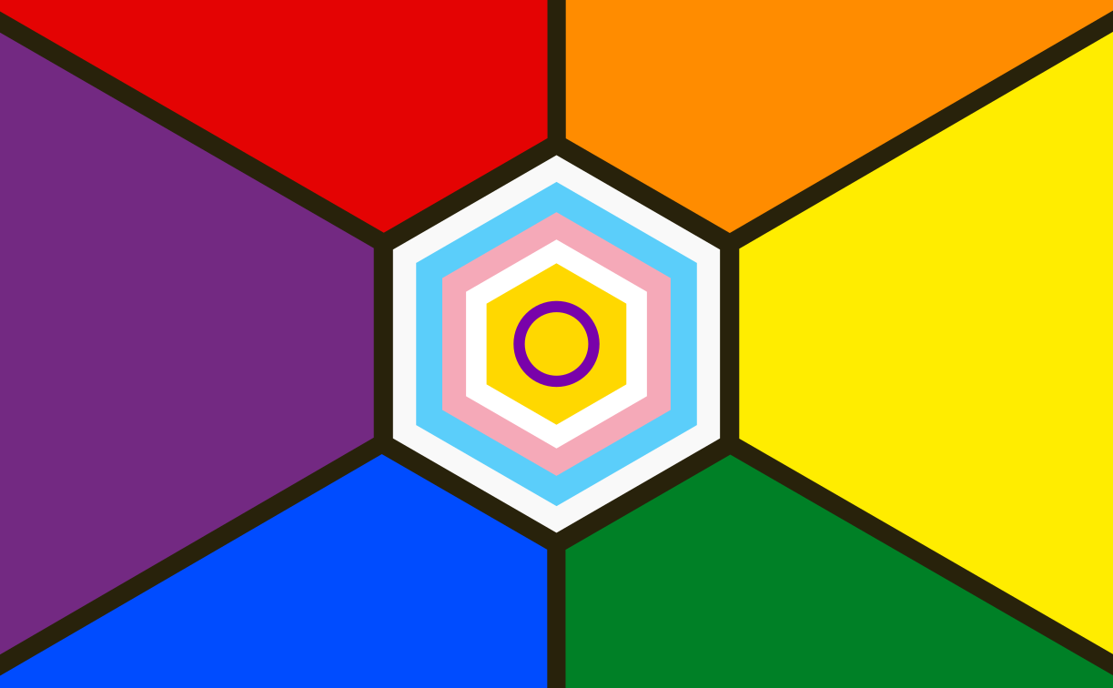
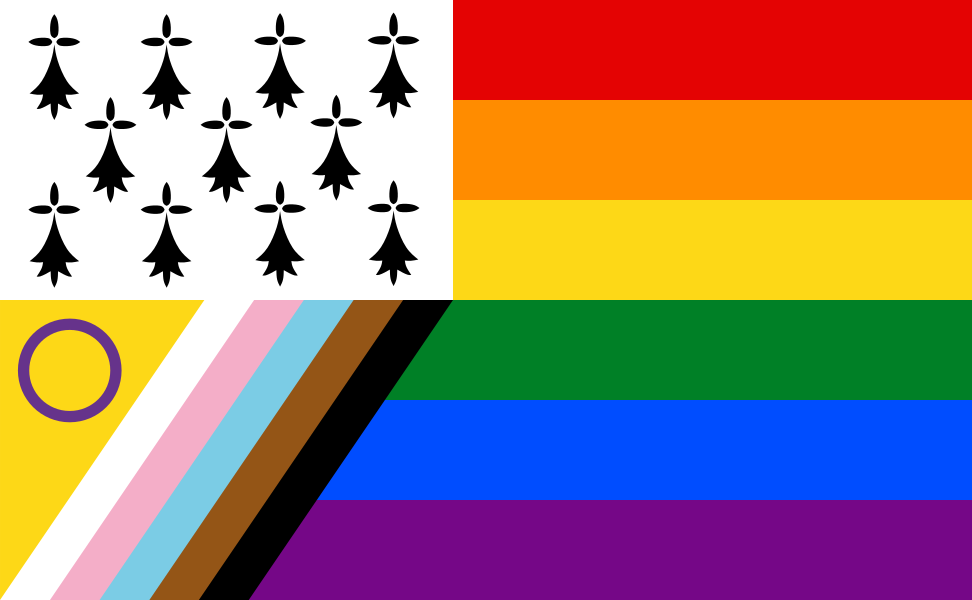
The Philadelphia Pride Flag adds brown and blue stripes to the rainbow flag to represent LGBTQ+ people of color and address racism within queer communities.
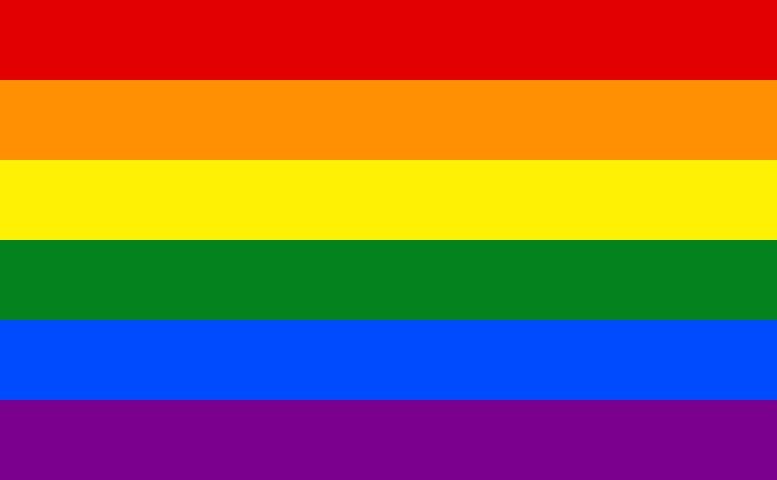
Two stripes added above the standard six-stripe rainbow: black and brown to centre LGBTQ+ people of colour who have historically been excluded from or marginalised within predominantly white LGBTQ+ organisations.
History
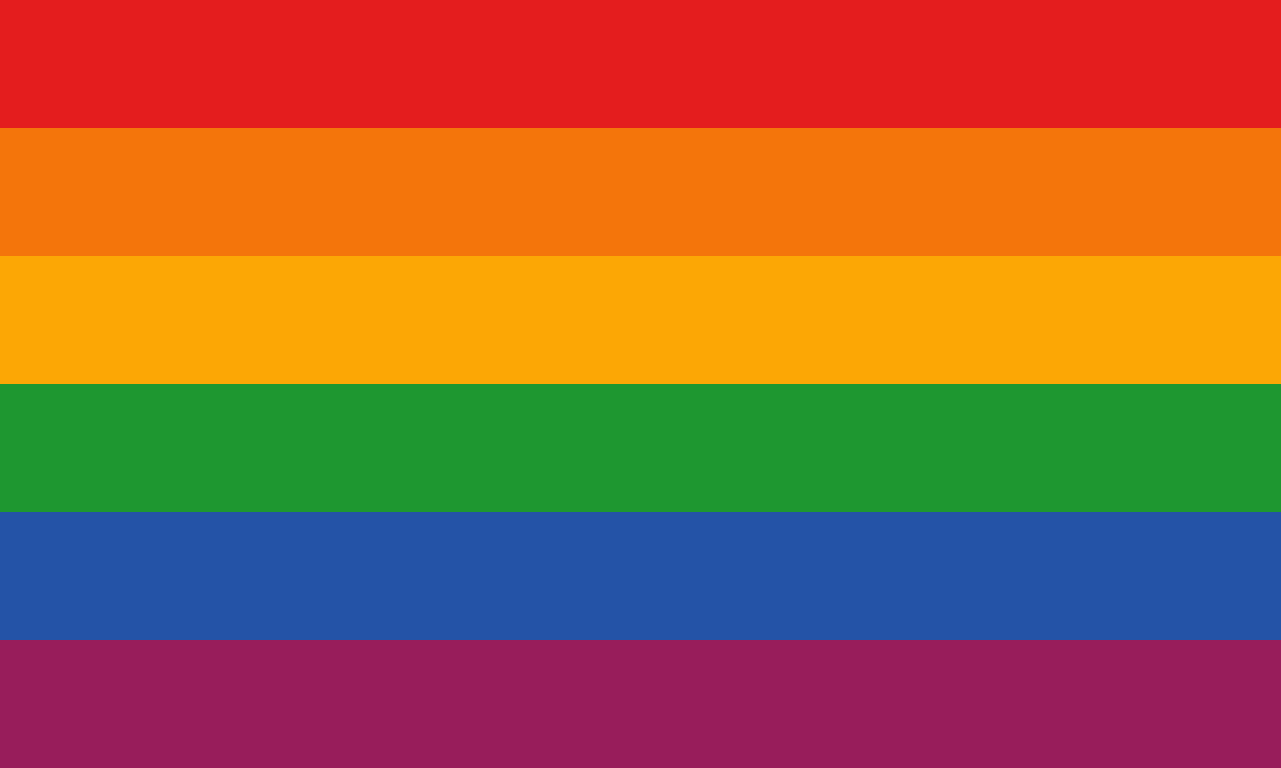
The Philadelphia Pride Flag was commissioned by Philadelphia's Office of LGBT Affairs in 2017 and designed by the advertising agency Tierney as part of the city's More Color More Pride campaign. The flag was created in direct response to documented incidents of racism within Philadelphia's LGBTQ+ spaces, including a significant 2016 incident at the gay bar ICandy that prompted a municipal investigation. The design adds two additional stripes—one in light brown and one in dark blue—to the traditional six-color rainbow pride flag, with these colors intended to represent marginalized LGBTQ+ people of color within the community. The flag's introduction sparked substantial debate within LGBTQ+ communities: supporters viewed it as an important acknowledgment of intersectional racism, while critics questioned whether racial identity should be encoded within a flag primarily representing sexual orientation. Despite the controversy, the design gained international recognition and served as the conceptual foundation for Daniel Quasar's 2018 Progress Pride Flag. The Philadelphia Pride Flag continues to be used by the City of Philadelphia for official Pride events and has become a symbol of intersectional LGBTQ+ activism.